Big Ol' Non-Watery Blue


This little guy woke me up early for an entire month. I took this the last day they moved the machinery away for a new phase at the construction site. It's sort of a bitter-sweet memory of that hateful bastard.

Ceiba Tree


Ceiba Tree, located at Quebradillas, Puerto Rico
Composed of 4 shots, this Ceiba tree is located right next to another one of equal beauty in the middle of a highway, some assholes wanted them taken down but someone with a heart and a brain succeeded in leaving them intact and altered the planned highway plans, so that the road would go around them. Thank you, whoever you are.

Glascow Machinery

In response to Nazario's request, here is what's behind the actual ruins.

Glascow 1883

So I admit I've been getting caught up on photography and sort of abandoned photo-manipulations like a bastard child.

So while I fix that, I'll share this itty bitty.


This picture, pictures actually, was taken in my hometown, Yabucoa, Puerto Rico. The murals you see are what's left of some sort of facility that existed more than a hundred years ago, and some of the equipment (currently not shown but might post later on), which consisted of gigantic gears and some sort of pipe system, is dated 1889, with the name Glascow next to it.

I'm still trying to find more info on the site.

-EDIT-

Fixed the post's title, it's actually 1889 1883.

Cocal Beach, Yabucoa, Puerto Rico

So, I'm back to one of my proud moments in photography, I went to one of the local beaches in Yabucoa and decided to a really FUCKEN WIDE PIC of it. Actually it's more like 17 pictures. And I'm tired of milestones now, this one was 800MB and I was fucking pissed.

So it's not gonna be an accomplishment to surpass that as much as it'll be a nightmare.


https://blogger.googleusercontent.com/img/b/R29vZ2xl/AVvXsEiG_nS_H9YW6YVfJSlV0Ym-X5PQu3hFl1TGngJmzKr6-WY2xMp0YBJuCfhHHcifUITqhqY7L8J9EWfP_GGzQmMC3QNK9_sTXcymduhTwBEVO1ZC4XliZ-XdEFPzmChJFDgxVVagg0pvX597/s0/Cocal+Beach+-+Yabucoa.jpg

Puerto Rico Convention Center - A milestone in my computer

Last Friday I was attending a graduation ceremony (how I hate those) at the Convention Center, San Juan Puerto Rico. Instead of photographing people I went for something far more interesting, plants. But as I walked further from the Convention Center, I saw this giant man-made structure and I just had to stop and take a bunch of consecutive pictures and hope for the best.

Today I built up the courage to finally "stitch" all these pictures together and well...

This whopping beast has beaten my "Biggest PSD Filesize" record, held previously by the Mortal Kombat (Raiden vs. Scorpion) Photomontage (at 143MB), and before that, Dreth - Energy (76 MB).

This one is 160 MB, but you won't be able to tell why, since the uploader tool greatly resizes the entire image.


Click for a bigger version so you can see all the fuckups.

Beavis & Butt-Head


These are the NECA Head Knockers of Beavis & Butt-Head, they're pretty detailed and they are around 8-6 inches. So I can use them as my wang's replacement.

Mau Creek

This is the first picture I'll post from my Canon Rebel XTi, it's a series of shots from a small creek in the neighboring town of Maunabo. Minor Photoshop involvement.

MS-Paint Beetlejuice

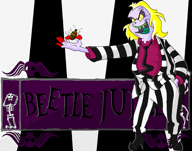
And now here's Beetlejuice!

This was my first time ever drawing this guy, having around 4 pictures as reference, I managed to draw The Ghost with The Most as shown in his animated series that ran in the early 90's. As you may or may not know, the Beetlejuice movie was what made the first Tim Burton Batman movie possible. So I guess you could say I'm on a Tim Burton roll, but don't go thinking that now I'll draw that idiot Edward Scissorhands.

On to the notes, I didn't have a background planned for this one as I started it, and nothing in the Neitherworld is easy to draw, it's got that random look that looks like it was made by a 7-year-old yet it takes quite some practice to get it right if you wanna replicate it. At first I thought I would BJ's house, then I thought about Lydia's house, but I saw the intro again on YouTube and decided to go with the cartoon's logo.


As I said, I didn't have a planned background, and I had reached the end of the main character's drawing, as you know, MS-Paint doesn't have layers, so doing a background around Beetlejuice is a must. But I cheated a bit, I made the background in an entirely new document and then pasted Beetlejuice over it. I'm not particularly proud of it, but it had to be done. The letters would've been amazingly difficult to "visualize" behind BJ, thus making them unproportionate.

Not much to tell here, it took me longer to finish than Batman because towards, I was feeling uninterested, but once I started the background (yesterday) I managed to finish it.

Beetlejuice
Beetlejuice
 Beetlejuice
The Joker

Here's one I should've posted along with Harvey Dreth, it's Batman: The Dark Knight's take on The Joker. With the hype of the movie, many shitty Photoshop edits started waving left and right from every corner of the Internet, there were even tutorials.

None of these helped me, because I didn't have the poses they showed in tutorials, nor were my pictures of the same quality. Consequently I directed my attention to the movie's own promotional ads, more specifically this one:


So I went ahead and took a picture of my hand with some crappy cotton black Halloween glove I had laying around with a really old Joker card from a normal card deck and grabbed an old picture that had no real purpose besides just taking space from my preciously limited Hard Drive.

I started doing this after watching the movie the day after it came out. It was mostly rushed but ended up better than I expected, but my expectations weren't that high anyway.

W.I.P.


Finished Joker


The only thing that's not mine are the teeth, which I took from some random Google Image Search result bastard.

Beavis & Butt-Head and Batman: TAS

So I've had this amazing pain on my lower back, it's really annoying. I can't do anything fun, my drum set is picking up dust and I have to remain in bed most of the time, my original desktop chair is either too old and lost all comfort or my back is that messed up and I can't use it anymore.

Either way, it gave me time to catch up on my pending crap, first one is a screenshot of Beavis & Butt-Head opening splash:


Which, needless to say, is fugly considering it was a really, really, REALLY cheap animation and it was left intact throughout the whole series. So my original project was to recreate it, with better colors and sharper lines and what-not. I mainly traced it completely because I was happy about finally learning to use the damn Pen Tool after using Photoshop since 2002 or so. The only thing I skipped was the MTV logo, I simply Google'd the render, pasted and painted it accordingly. I wasn't ambitious with this so I turned it from 640x480 to 800x600. I figured it was simplistic enough for it to look good even if stretched on higher resolutions.

The Beavis & Butt-Head Wallpaper:


Next up is something of a personal, sentimental project because I've always had MS-Paint next to my heart. It was the very first thing I got my hands on as far as editing went, and it mainly consisted of cutting and pasting certain spots to hide another spots. I learned about pixels and anti-aliasing the hard way. Nevertheless, it is overlooked because of its simplicity, but for someone like that, that has given up pretty much completely drawing on paper, this is as close as it'll get.

Now being a Batman fan is no secret of mine, I even find it creepy sometimes, but I realized, since Elementary School, I had not completed a Batman drawing, not even once! So this started out as a signature, like the one I have of Donatello (also in MS-Paint), but rapidly went out of proportions, it was only going to be Batman's head and his cape by his side, maybe a Bat-A-Rang, but as I wanted to include a cape I resized the image in order to sketch a little bitch and forgot to resize back to its original sig-size. One thing lead to another and from a small signature it went on to become a big 1024x768 wallpaper.

Batman: The Animated Series Wallpaper (MS-Paint):


Now before I get some crazy fan bitching because of the details, I must confess I made some small changes to it. Batman's eyes are smaller, I never really liked its gigantic triangle-eyes a lot, I also changed the Utility Belt's design a bit. The show's belt was really plain, just one big yellow belt with no superficial features except for a big center buckle and some odd ovals at the sides.

The grappling gun's handle was also modified for a more realistic style, the original was in a T-shape and he would put three fingers on one side and two on the other, uncomfortable if you ask me. The Bat-signal has the 'retro' style from Tim Burton's 1989 Batman film (the best in my opinion) instead of the oval-shape Batman logo found on his chest.

And if you think that because Paint has a Text Tool I'm gonna use it, you're dead wrong. You can zoom in and see for yourself that "Batman" is actually hand-made, if you use the Text Tool included in Paint you'll end up with the only thing that will have anti-alias (e.g. smooth borders) and it will look odd compared to the rest.

That's all for now. I might pay more attention to MS-Paint nowadays.

Two-Face Dreth / Xaira Fairy

Here are the two latest Photoshop jobs (I really need to come up with a name for these) as of now. The first one is Batman: The Animated Series' Harvey Dent/Two-Face, who I always liked because he was the most violent of criminals in my opinion in the series. He was also pretty normal if you were willing to overlook the fact half his body was scarred and blue due to an explosion.


The idea came to after seeing this picture of Obama as Two-Face. I saw how easy it'd [supposedly] be, so I went ahead and burnt half of me. Here's how it was coming along at first:


I took two pictures, one normal, another with the crooked mouth, with a black Bad Religion jacket on top of a long sleeve white shirt and a crappy tie I had laying around. After fiddling with the face for the initial draft for a few days (I get bored fast), I realized the Black/White color scheme of the tuxedo wouldn't work with me. After searching for pictures, mostly fanart, of Two-Face, I decide that it doesn't HAVE to be Black/White so I go with something noticeable yet not too light. Most of the strain weint into the mouth and hair, I'm not fully satisfied with the hair but if I keep working on it I'll make it worse.

Now the second piece was for my soon to be girlfriend, she only asked for wings and "some stuff" so I decided to once and for all learn how to use the freakin' Pen Tool. Ironically, instead of using her favorite colors, I used mine. But I think it helped in the overall fantasy effect. It's my biggest Photoshop job so far, in terms of resolution.